THE BRIEF
PART 1: Redesign a property profile page (Zoopla) and replace the branding and styling with your own vision of a property portal startup. Identify the pain points, and reimagine how this page could be displayed.
PART 2: Reimagine the booking flow. Through wireframes, show how you would improve the Book a Viewing / Contact The Agent flow.
My interaction with the prototype
THE DESIGN PROCESS
I had only three days to complete the challenge so I used Lean UX design process (think, make, check) in order to reduce wasted time and resources, and produce a workable product as soon as possible. Through iterations, I made revisions and updated my designs as I gathered user research information and draw valuable insights.
My initial step was to gather research and form a clear idea of who are the property portal users and how I can help solve their problems with my design.
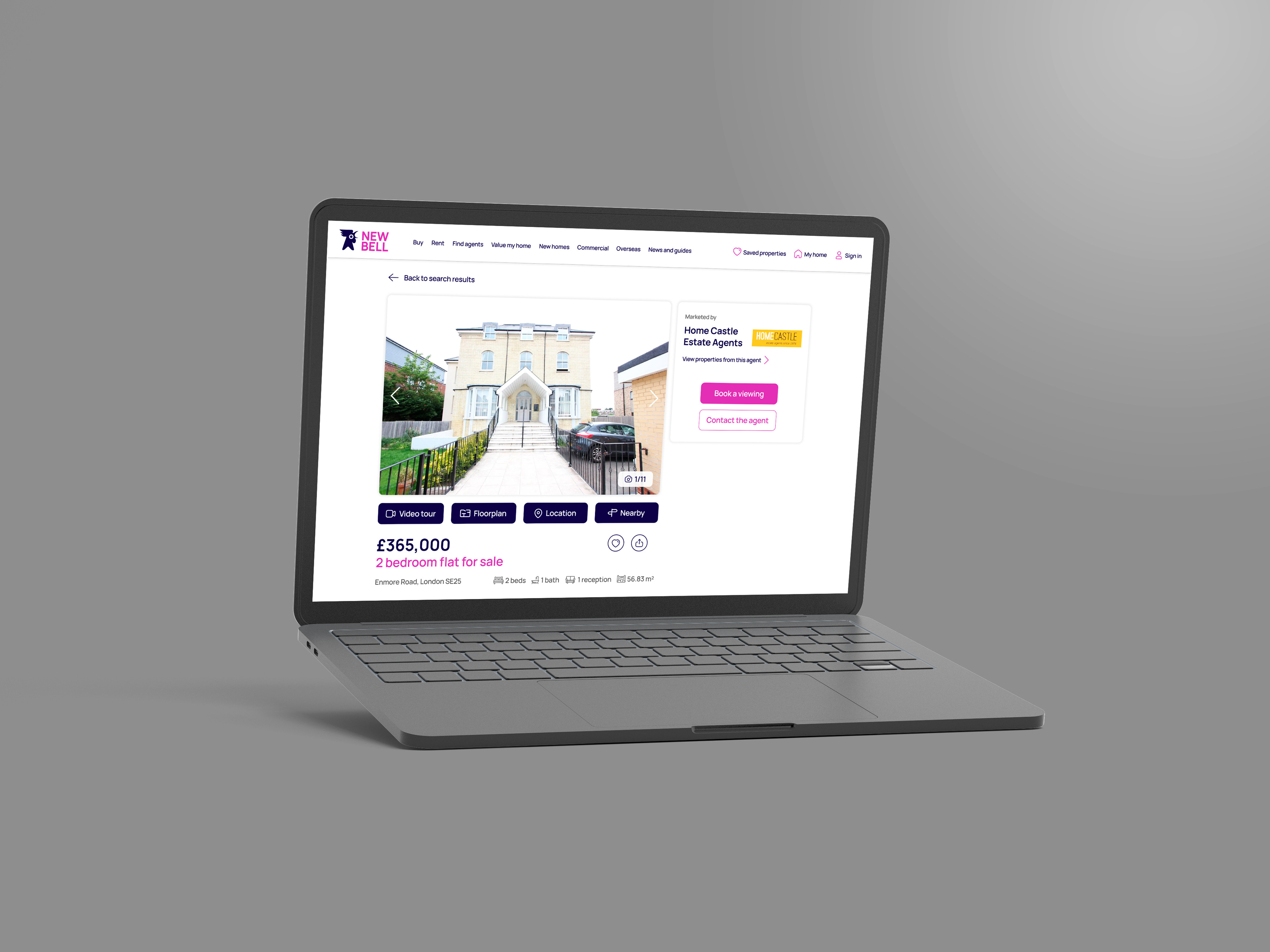
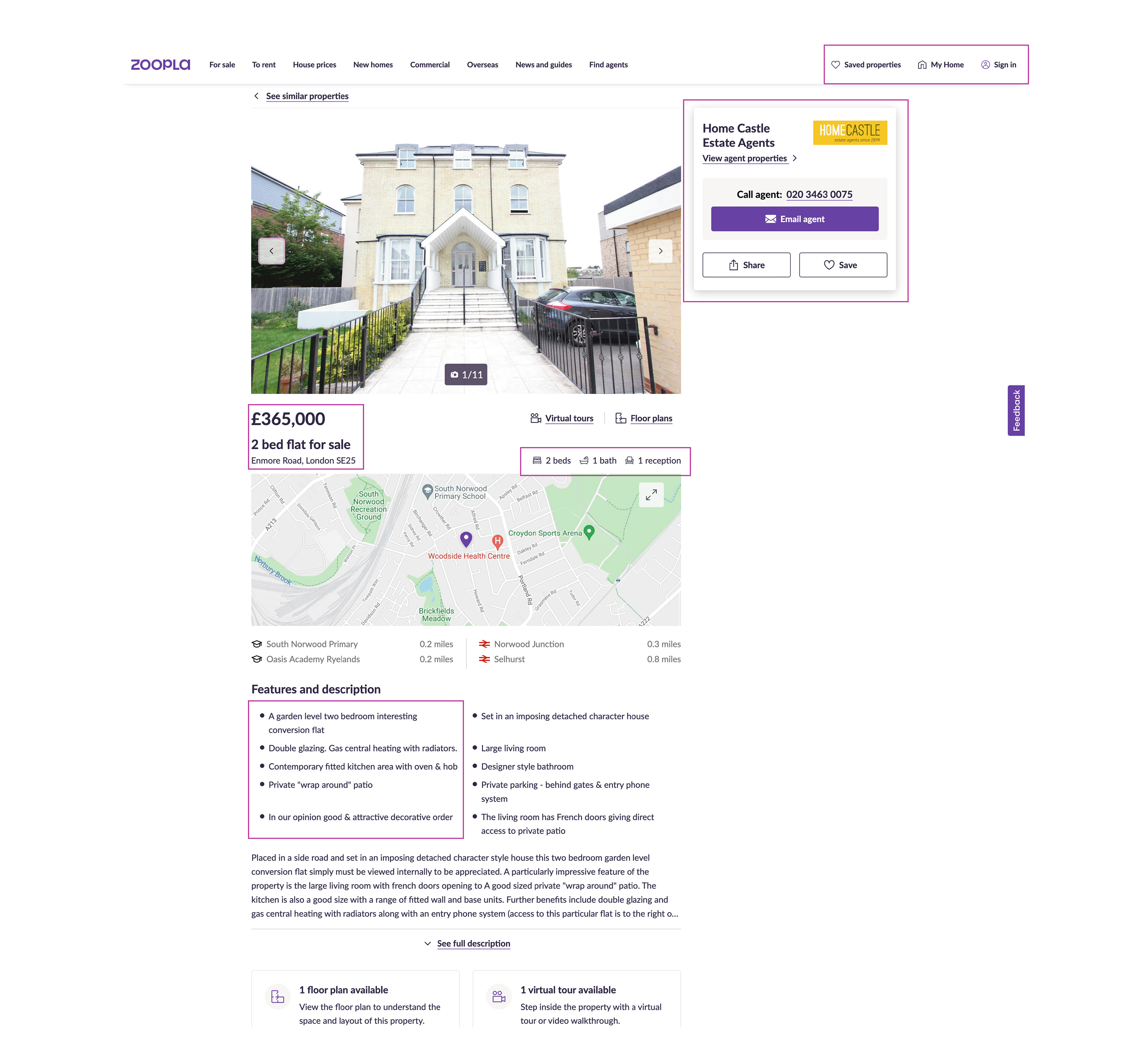
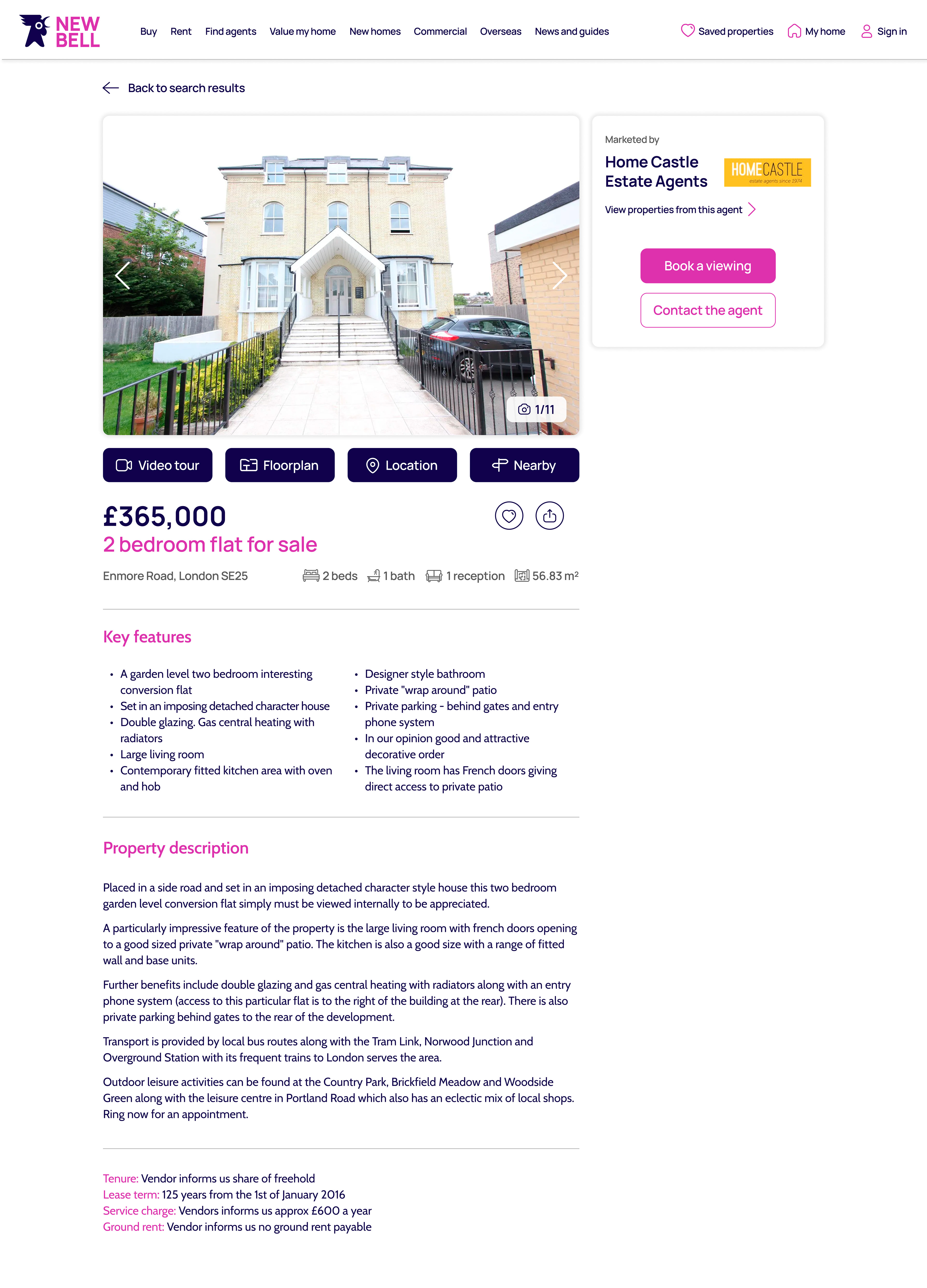
I checked Zoopla property profile page to identify pain points and problems the user might be facing. I also noted those good features that can be left unchanged. The purple rectangles show the elements I would like to keep. You could clearly identify the My home menu section from the main menu. The layout gives plenty of white space. The sticky estate agents box on the right makes the navigation easier. The hierarchy order: price, property, address. The bullet points increase readability.
I was surprised there wasn't an option to book a viewing. I found the sticky feedback annoying when scrolling. It distracted my attention from the advert.
After that I interviewed two potential users. I showed them the page to tell me what features they like, what can be improved and what they find annoying. I asked them about their vision for a property portal, their needs and what problems they were facing when searching to rent or buy a property. Unfortunately, I didn't have time to create detailed empathy maps about my personas. I kept notes about what my users said during the interview and every design decision was based on solving their problems.
MEET THE USERS
Ariana recently bought a house in London and has experience communicating with property estate agencies. Her pain points. The property agent didn't pick up the phone when she was calling. Sometimes it was taking weeks for the property agent to reply to her emails. Many property portals didn't offer an option to instantly book a viewing.
Problem statement: Ariana, a multitasking, tech-savvy working mother of a girl, needs a way to quickly book a property viewing in order to spend more quality time with her family.
Alberto lives in London and wants to buy his dream house. He is a first time buyer and does not know much about real estate agencies. He values his time and hates when he goes to a property viewing only to find out that the property is not as spacious as it looks at the photos. The most important features for him are: the price, the location, the floorplan with square meters and the nearby stations. He wants an easy access to those features. In addition, it would be great if he could track his viewings.
Problem statement: Alberto, a hardworking professional needs to track his property viewings and easily find important property details (price, location, floorpan, nearby) in order to dedicate more time to his friends and sport activities.
COMPETITORS ANALYSIS
I researched who were the biggest property portals on the market. To mention a few: Rightmove, OnTheMarket, Prime Location, Smart New Homes, One Dome, Purple Bricks. I searched for a property in all of them and evaluated my user experience. For instance, you could book a viewing in a few easy steps on Purple Bricks platform. I also focused on the UI design and marked the best visual elements.
After I conducted my User Research and analysed the competitors, I experimented with the layout and tried different variations. I used 12 grid layout for the desktop platform and 4 grid layout for the mobile devices.
The chosen typefaces are: Manrope, a modern sans-serif font, and Cabin, a humanist sans inspired by Edward Johnston's and Eric Gill's typefaces, with a touch of modernism. They are a good sans serif typeface pair, great for digital platforms.
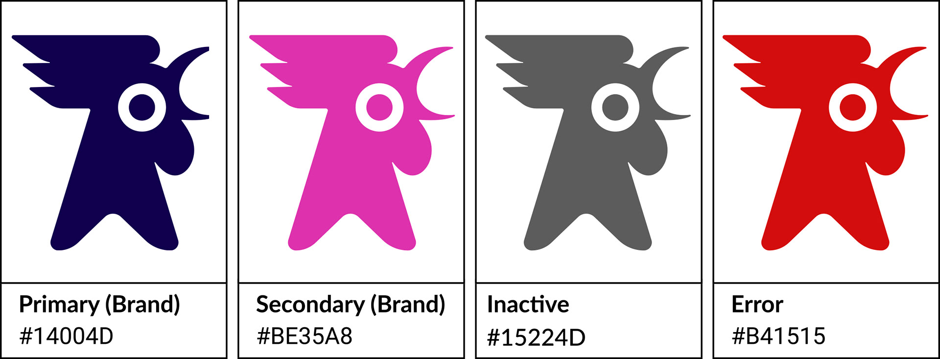
The logo mark is a rooster. Rooster symbolism is linked to good luck, wealth, and fortune. It stands for a new day and new beginnings. The brand name is New Bell. Every property has a bell and I wanted to associate the company with the new and fresh. I decided that this will be the name after I made a list with possible names and conducted a short survey asking in a Facebook group some lf my friends what is their favourite. Those were their top picks: New Key, Dream Key, Keyring, New Move, New Bell.