MIRONE APP BRIEF
Mirone ski school is based in Pamporovo, Bulgaria. As one of the premium ski schools in the resorts, they wanted to be ahead of their competitors. The brief was to design a mobile application that will facilitate users to book winter sports lessons and equipment. The app will distinguish them from the competitors and maintain their leading position by providing a great digital service for their users. Users will not wait in queues and stay in closed spaces with people from other households (crucial during the Covid 19 pandemic). In addition this service will extend their time on the slopes enjoying the winter sports they love.
Why an app?
Almost three quarters (72.6 percent) of internet users will access the web solely via their smartphones by 2025, equivalent to nearly 3.7 billion people. If the business does not offer a mobile-friendly platform and ensures outstanding user experience, it is practically non-existent. Furthermore, when users go on holiday, in most cases, they bring only their mobile devices, not their desktop computers or laptops.
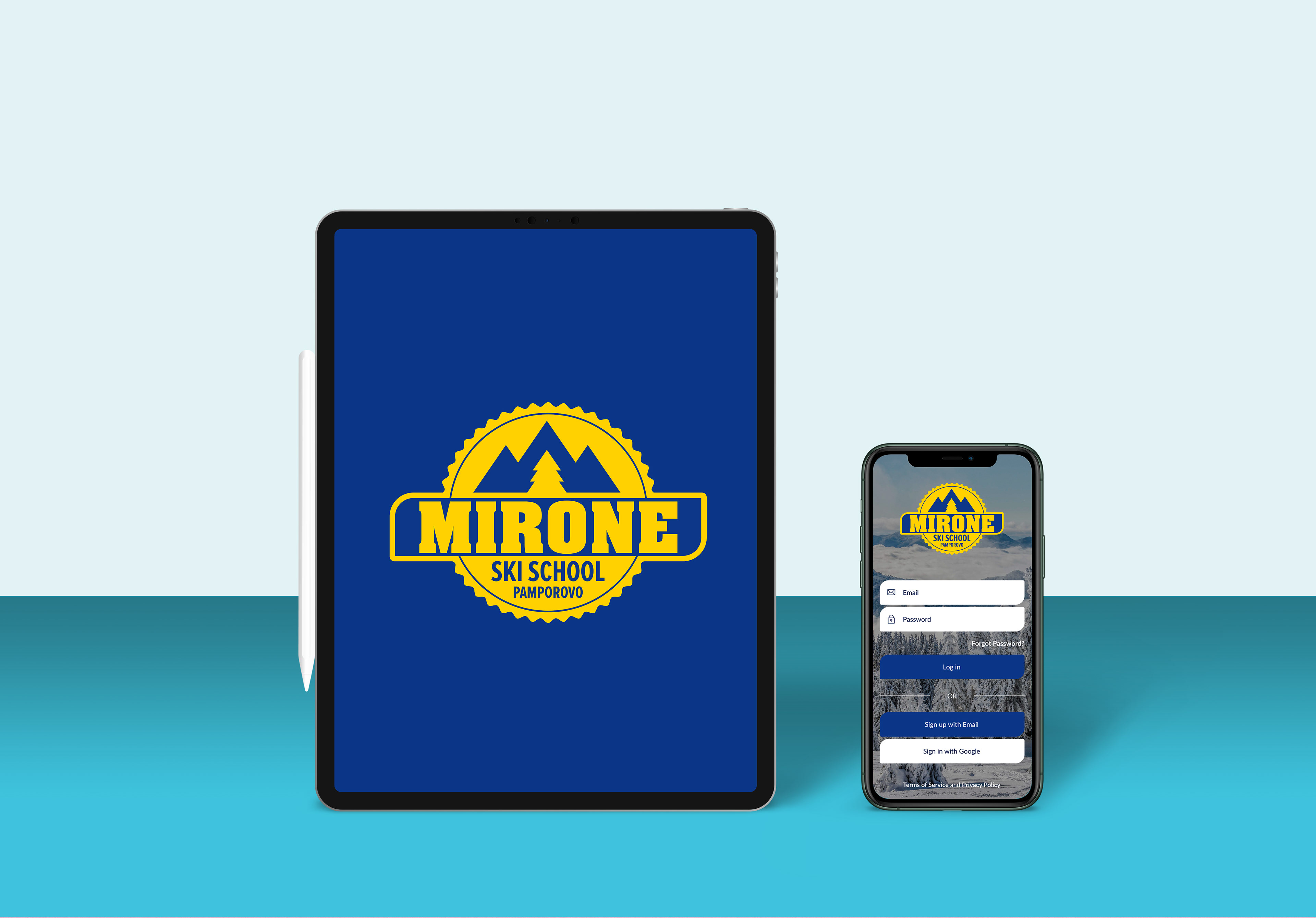
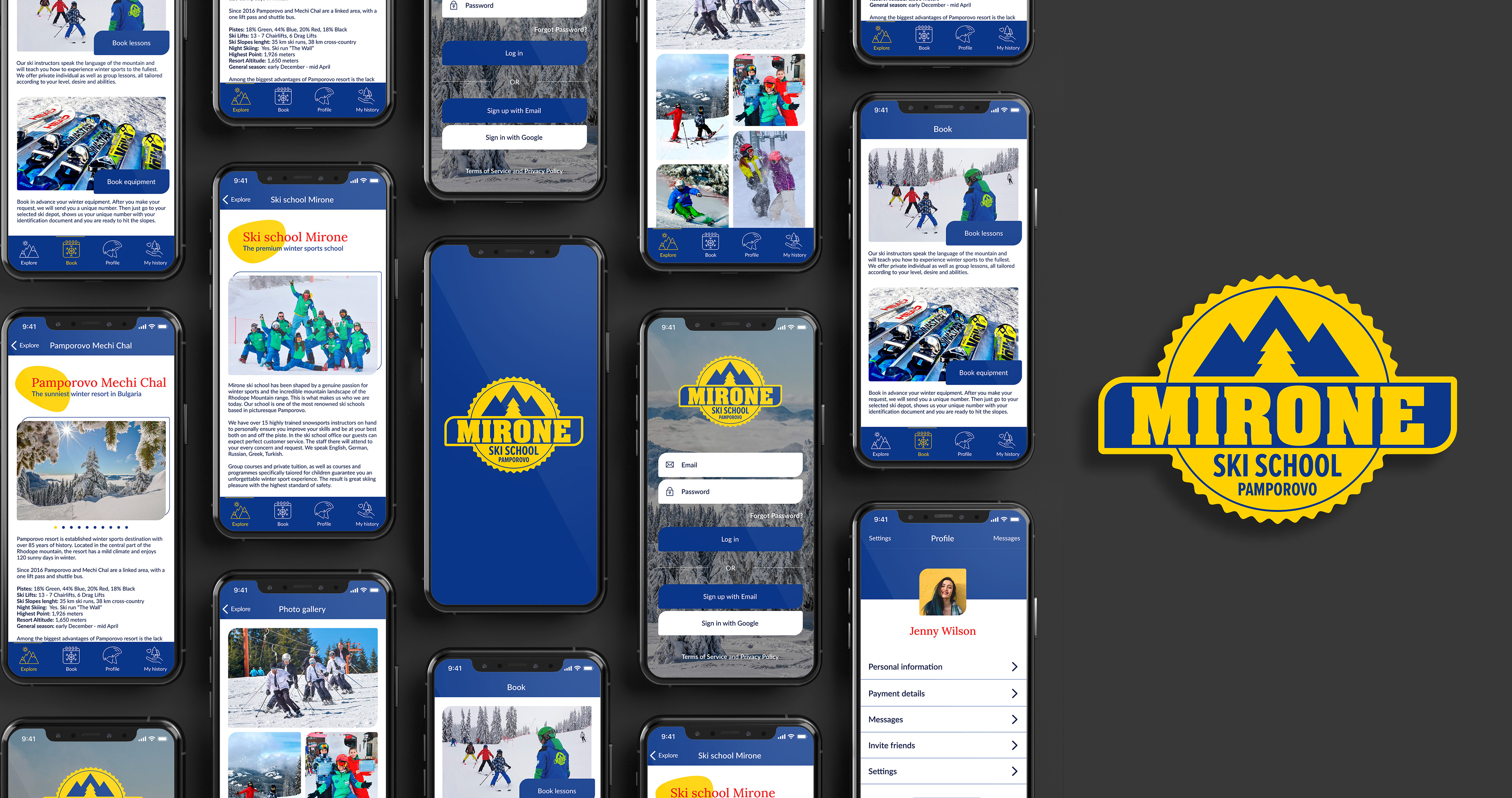
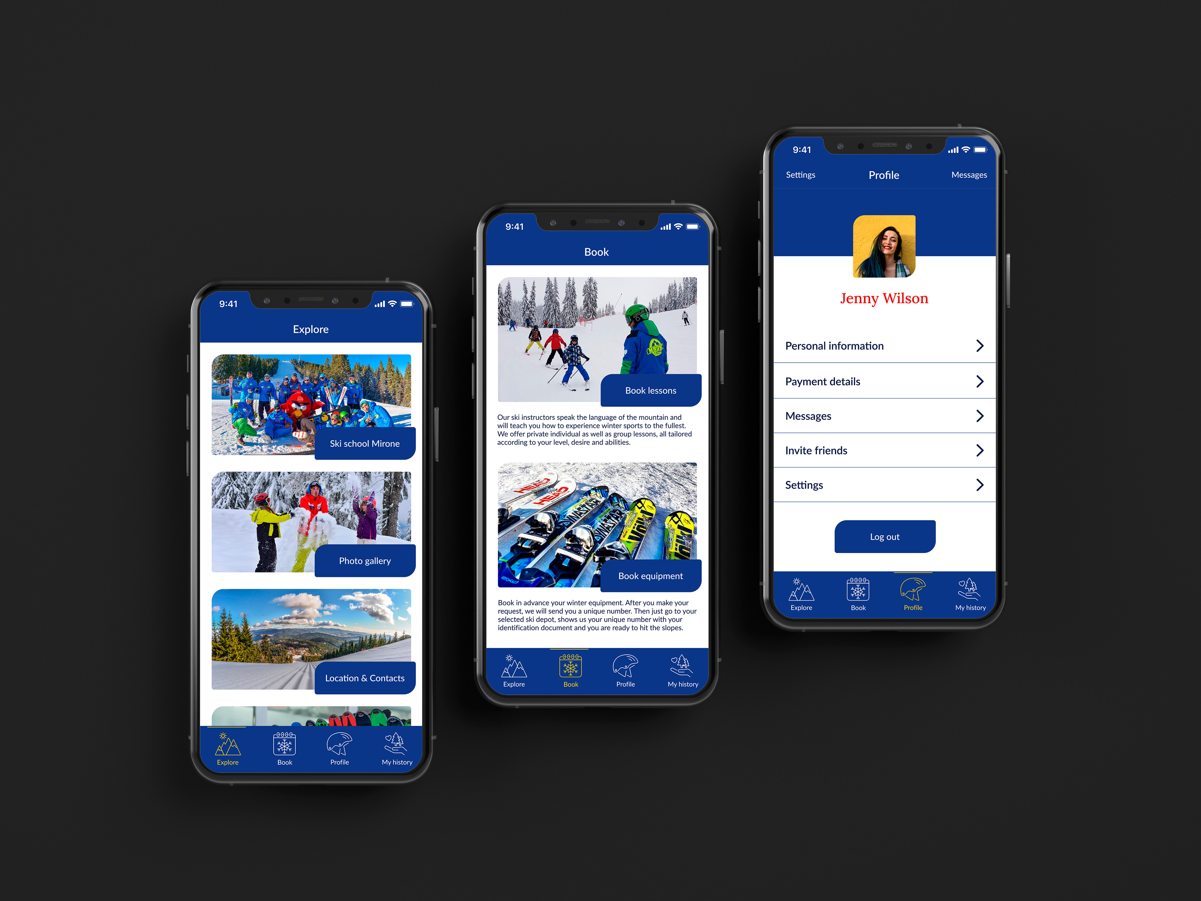
A prototype of the app, designed in Figma, showing possible user interaction
COMPETITORS ANALYSIS
Mirone ski school is one of the leading ski schools in Pamporovo with a great reputation. It has four different depots and a team of 15 highly trained snow sports instructors.
The competitors analysis showed there are 65 ski schools in Pamporovo (official register of Pamporovo ski schools for winter season 20/21). I found out that none of them offers an app for booking winter sport lessons or equipment. Most of them had online presence: a website or active social media accounts on Facebook and Instagram. More than half of the websites weren't mobile friendly. Investigating the content in their websites, I found out that the user could find prices for ski rent and snow sports lessons but would not be able to make a reservation online.
Mirone ski school would be the first ski school in the resort to offer an app which will facilitate users to book snow sport equipment and lessons.
USER RESEARCH
With the help of Mirone school, I organised a focus group of 10 people, 5 of them were loyal customers and the other 5 have have not tried winter sports before or used services of other ski schools. The main objective was to find a way to improve the Mirone ski school services for the existing customers and ensure outstanding user experience for the newcomers. We had a moderate discussion about their ideas, desires, needs and what sort of information they expect to encounter in the app.
After that I analysed the gathered information and sorted it into different topics. Then I have selected 4 people from the focus group and conducted individual interviews going through each topic to obtain further insight information and form an unbiased opinion.
In addition to the acquired information, I used my personal knowledge for the user, which I gathered through my direct observation research during the 5 years of experience I have as a ski instructor for Mirone ski school. They trusted me with this project not only because of my design skills but also because of my great snow sports expertise.
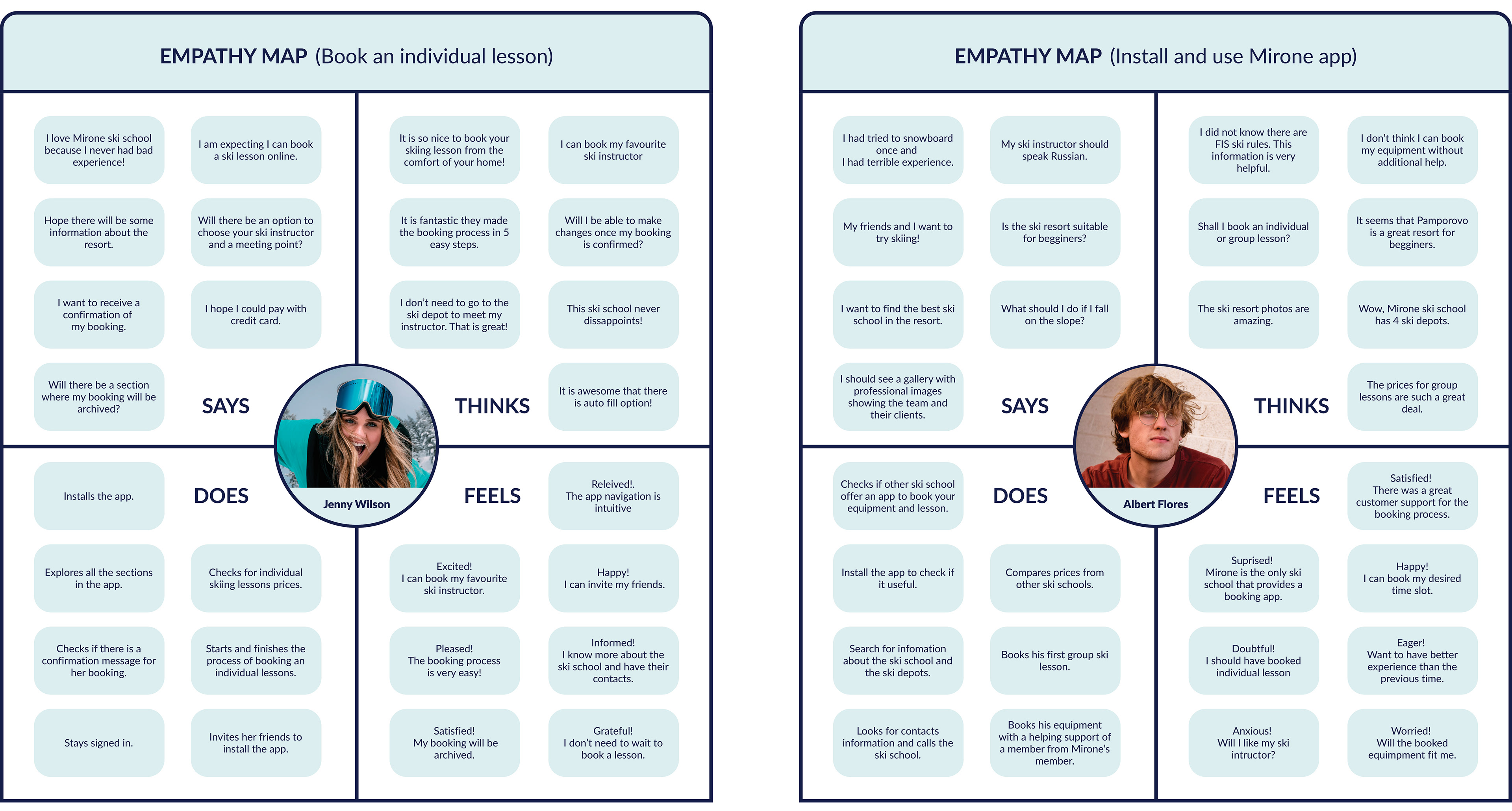
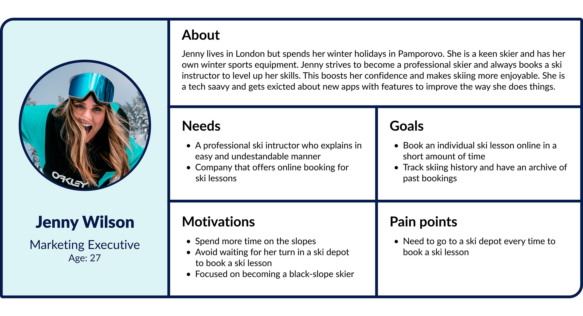
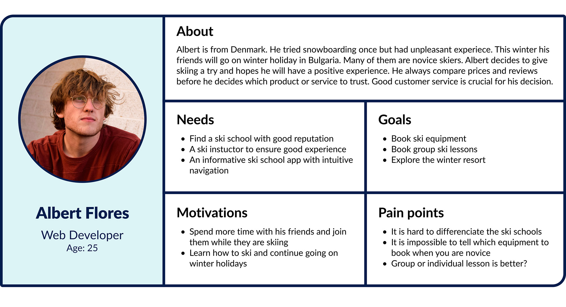
Based on all this information, I created empathy maps to get a precise view of the user's mindset, aid my decision making and protect it from unfounded assumptions. This step helped me to better shape the user personas.
During the process of designing the app, I often referred back to the personas to maintain a user-centred approach and ensure user needs and goals are met.
INFORMATION ARCHITECTURE
Throughout this crucial planning stage I stayed focussed on making life less stressful for the users and connect them with the content and the context of the solution. My aim was to make information easy to understand and interact with, so I focus on the underlying structure, grouping, and labelling. Every decision was validated with user testing and continually refined until the app allowed the users to quickly find what they are looking for.
Card sorting was used to design and organise the information in the app. Users were asked to organise the content into groups that was logical to them. From the gained insights, some of the initially intended content, like weather forecast section, was discarded. All the section were labelled with easy to understand descriptions to ensure users will find the information as quickly as possible.
To facilitate the navigation, the tab bar provides users with constant access to the 4 main sections in the app:
EXPLORE: Gives an overview of the Ski School and its ski depots, the resort, contact information, FIS Ski rules and access to a photo gallery.
BOOK: Clearly divides the content into 2 parts – book lessons and book equipment. The booking request has a progress steps indicator and clearly shows the user on which step they are. In addition, it is easier for the user to fill in the form in small chunks.
PROFILE: A profile page with an access to personal information, payment details, messages, settings, option to invite friends to install the app and log out button.
MY HISTORY: Shows previous bookings of equipment and teaching sessions. You can sort the information by using different attributes like: date of booking, date of learning session, instructor seniority, skier skill level
This navigation structure was validated by the users with tree testing. To assess findability, I asked the users to engage in a variety of tasks in oder to see how long it will take them to perform the task and the number of steps they will make before they achieve it. To ensure the app accommodated user needs, I engaged in a thorough process of mapping every point in the their journey. My goal was to build the most optimal pathway in reaching their goals.
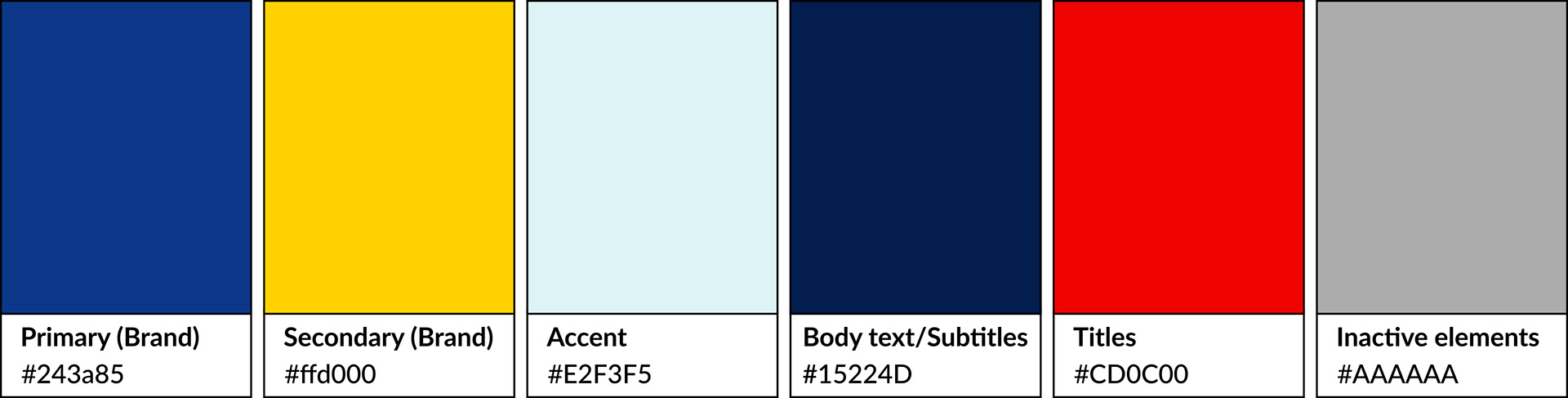
COLOUR SCHEME
I used Mirone brand colours for primary and secondary colours for the app. It was important to keep their visual identity consistent and expand their brand awareness. For fill in forms boxes, I used the accent colour. The other colours are displayed below.
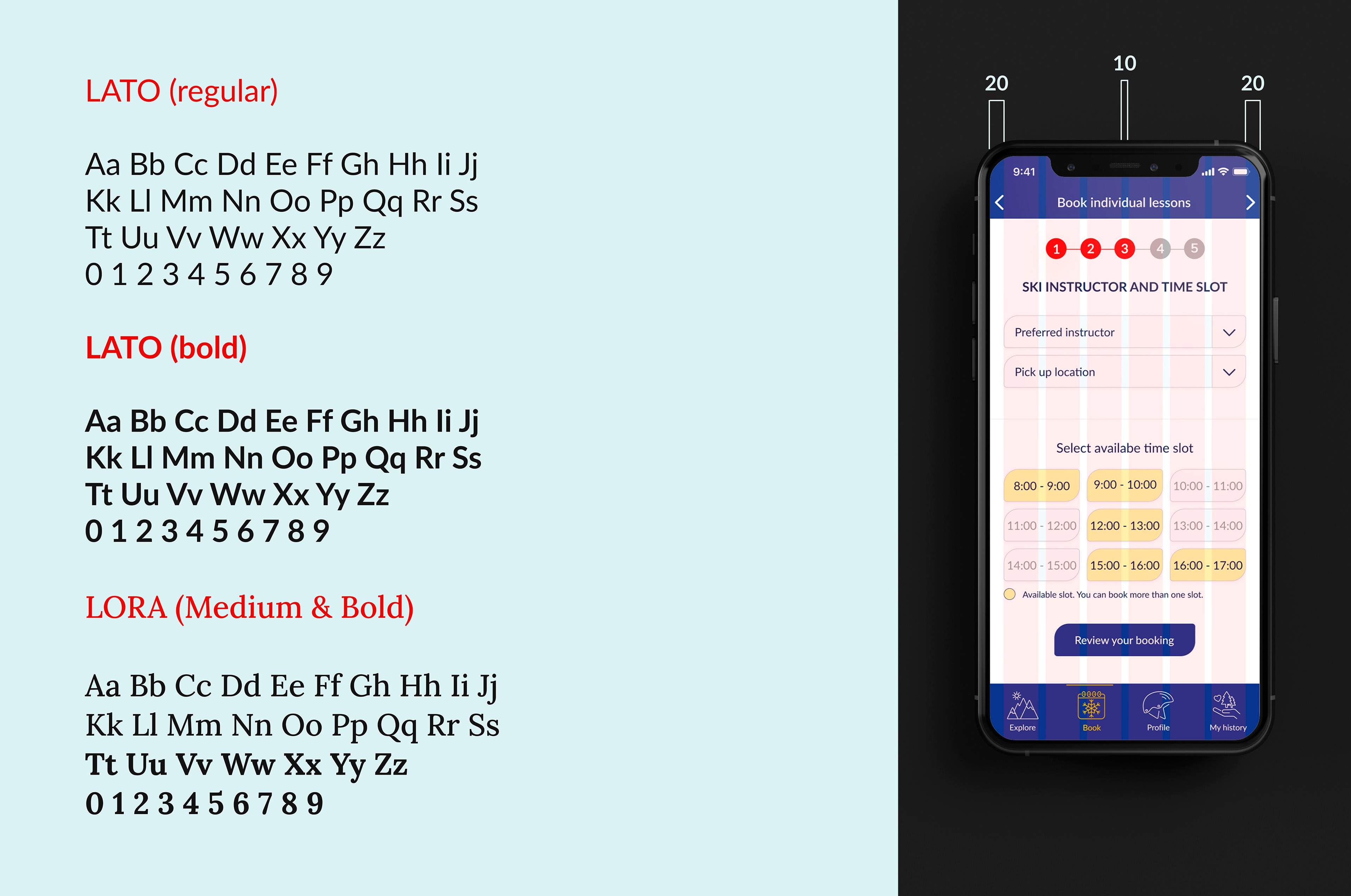
TYPOGRAPHY AND GRID
I chose mobile-friendly typefaces for the app: Lato (primary) and Lora (secondary). The 6-column grid maintains the good structure of the app and keeps content organised.
ACCESSIBILITY AND USABILITY
Accessibility is essential for some but useful for all. Therefore the app was built with temporary, situational and permanent impairments in mind!
In the initial phase of the project, the colour contrasts between background and foreground for the selected colour palette combinations were checked using the WebAIM colour contrast checker. The aim was to achieve high colour contrast of all information-bearing elements and all colour contrast ratios to be higher than 4.5:1 and pass the WCAG AAA requirements.
To ensure a great user experience for people with all kinds of disabilities, the app was tested with the Silktide website accessibility simulator and Spectrum. It was imperative to understand how users with dyslexia, colour vision deficiency (CVD) and other disabilities will see the app and make better the sections which might cause confusion and harm the app usability.
To provide the user with high readability and legibility, the app uses web friendly typefaces: Lora and Lato. Text size is sufficiently large and has a high contrast with the background. It is easy to read even in very sunny winter weather where snow reflection reduces the screen contrast even further.
The app was checked for colour dependencies using a grayscale test. The navigation menu uses a colour independent indicator (a line) in addition to the colour change (from white to yellow on a blue background) to clearly distinguish the currently selected menu icon.
All icons have clear meaning and have text labels to avoid ambiguous interpretations.
Helpful messaging is provided. For instance, in the lesson booking fill in section, when users are asked to select their winter sport skill level, there is an explanation on “How to define my level?” for those users who do not know how to define it.
There are generous tap targets, and interactions are sufficiently sized and spaced.
Buttons wording signifies a call to action, it is concise and uses task-specific words. Here are a few examples: Book lessons, Review your booking, Proceed to payment.
The shape and border radius of all buttons, fill-in forms boxes and image frames are consistent throughout the app. Their unusual shape was intentionally chosen. One of Mirone’s logo elements has this shape.
Usability Testing and User Journey Mapping. We asked users to perform different task on the app. Few examples are: book an individual lesson, book an equipment, While the user was performing their tasks, we were able to identify their frustrations and later have changed the areas that were causing confusion.